Purpose Statement: This blog post for the Writing 310 class compares two different resume styles, and explains which one is better for me personally to use.
For this blog post, we were supposed to find two different resume styles and talk about which one is better for our professional goals. I want to be a writer and editor, so I need a resume that looks skilled and professional. The two styles I chose to compare were this style, and this style.
Style #1: A fairly bland looking resume that makes good use of white space, has user-oriented design in easy access to information, and looks well-made.
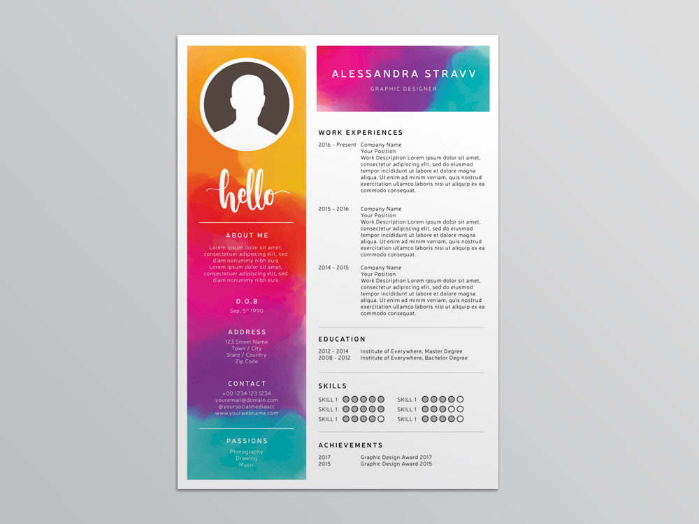
Style #2: A bright and colorful resume that catches the eye at first, but is clogged with needless information and trades professionality and functionality for initially pleasing aesthetic design.
If I were a graphic design major, an artist, or some other profession that may want rainbow colors popping off their resume, then obviously I would want to pick the second one. However, if I’m looking for a job as a professional writer or editor, then I would want the far more professional resume. It may seem kind of boring, but a good resume doesn’t need to be extremely interesting to look at. It needs to have the necessary information easily accessible. The rainbow resume looks good, but it’s confusing to find the information, and it trades space that could be used to convey why the applicant would be a good fit to catch the eye with bright colors instead. In the long run, it’s better for me to use the bland, professional resume.

I like how you clearly explained what would work for you and rather than having a colorful resume, you need a professional resume.
LikeLike
I like the contrast in Resumes you picked for your examples. I agree that while the rainbow one is very appealing, in many career fields having something that vibrant would be off-putting, and that the simple resume works just fine.
LikeLike